Hello there! It’s been a while. I’d love to draw your attention to this auction because it’s only live until 1 December, and the proceeds of sales will help The International Board on Books for Young People to continue its work of building bridges to international understanding though children’s books. Boy do we need international understanding more than ever!
So if you think you might like like to purchase a postcard sized Mini Masterpiece while supporting the IBBY, or if perhaps you’d just like to have a little peek at all the lovely art there, head over now to check out 51 artworks donated by 35 illustrators from around Australia. You can see a list of the fabulous creators below! Click on the blue postcard to be taken to the auction. You’ll need to create an account in order to bid, but it’s easy, and so worth it. The artworks are starting at just $75, (but as it’s a fundraiser I hope they will go much higher) Do spread the word. The artworks can be posted internationally too, in case you want to bid from outside Australia.
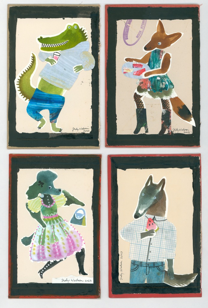
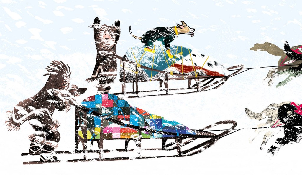
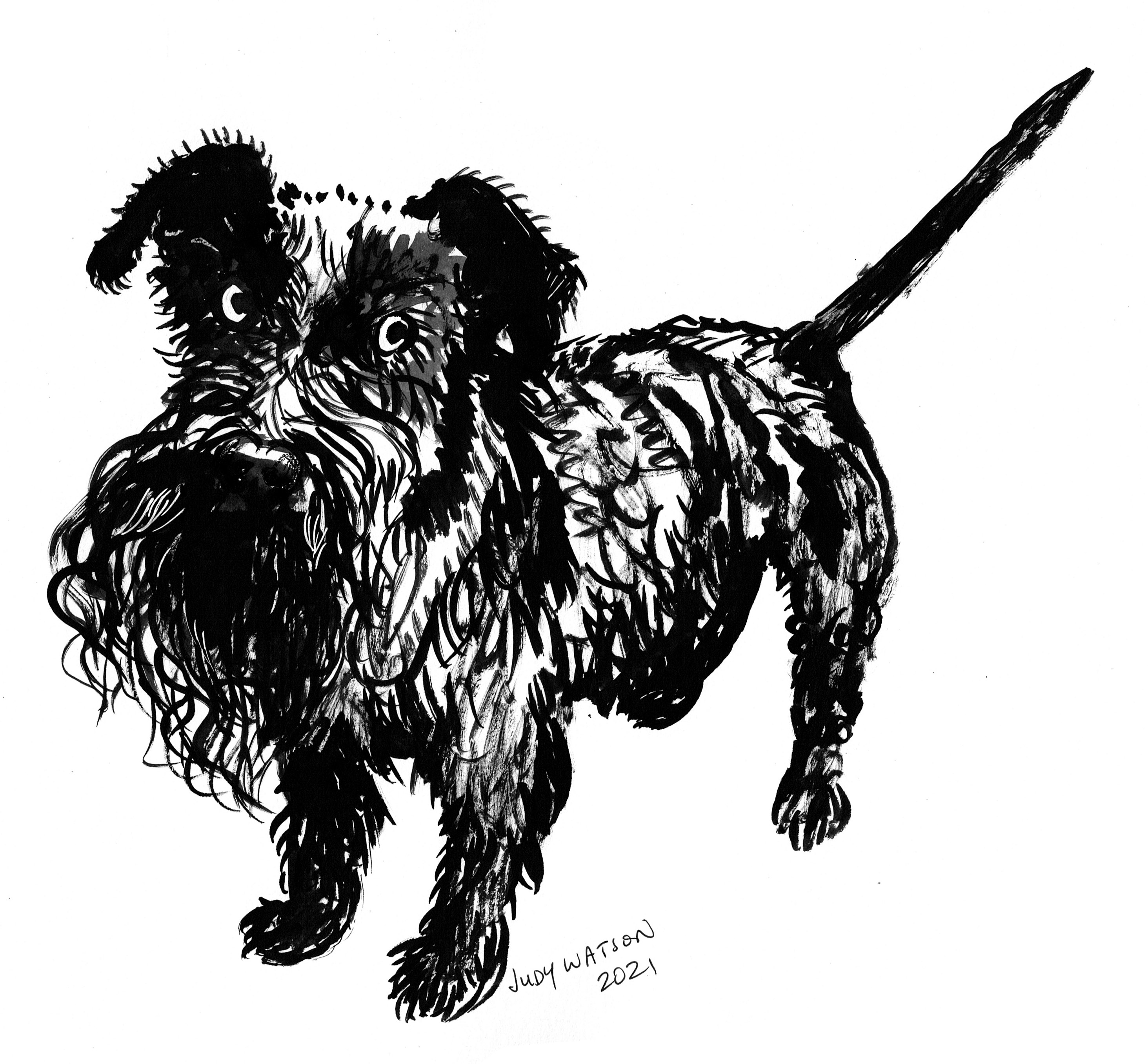
What do my mini masterpieces look like? I’m glad you asked. I’ve donated four mixed media works on up-cycled book boards, because I got addicted to making Party Animals.
Although these four artworks make a set, they can of course be bid on individually. The party animals’ names are Alan, Maxine, Jennifer and Mike. I feel as though I know them all. (Actually the names and personalities of three of them were inspired by characters from the TV series Russian Doll, starring Natasha Lyonne. She is absolutely magnetic. The fourth, Jennifer is named in honour of Jennifer Saunders’ dance moves with a handbag.)
This is Alan. He is not very comfortable at parties, but he likes to watch everyone else enjoying themselves, whilst standing in a safe corner eating snacks. This is Mike. Mike is in his element at parties. He can give full rein to his predatory instincts whilst enjoying a tasty beverage. Do not engage with Mike. He is best observed from a safe distance. This is Maxine. She is the host of this particular party and is great at catering for her guests, but still manages to have a great time as well. She may look fabulous, but she will defend herself from the likes of Mike with a well aimed kick if necessary. This is Jennifer. She loves those boots that she found in the op shop, but they are slightly too small for her feet. Ouch! And now she’s dropped her handbag on the dance floor.
I think I will make more for this series, when I can take a moment away from my publishing deadlines. They feel as though they are so very me. I’ve been exploring altered books for a lot of years, but I’ve mostly abandoned working on the typeset pages in favour of collaging onto book boards.
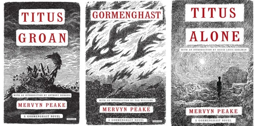
The prompt for the 57th Kick-About is the drawings of painter, illustrator, author, poet and war artist, Mervyn Peake.
Peake was the author and illustrator of the Gormenghast series which has taken on cult status since the publication of the first book Titus Groan in 1946. But for some it’s too dark, daunting. It’s usually classified as a fantasy, but it contains no magic other than the magic of Peake’s imagination.
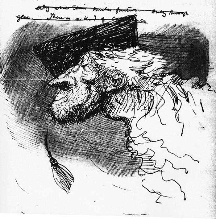
Peake was also a war artist. He was one of the first civilians to enter the German concentration camp at Belsen in 1945, an experience that had a profound effect upon him. His work was sometimes dark and grotesque. Other times his drawings expressed delicacy and softness, but they always emitted an intensity of personality and his use of light and shadow lifted even the prettiest of subjects far above anything that might be labeled saccharine. And then there are his drawings for his children. I have a copy of The Sunday Books, a collection of spontaneous creations he made on demand for his two small sons. In these, the images are flawed in the most lovely way. They are simply what flowed from his pen in the moment, with no polish, no corrections.
While thinking about Peake, I’ve been thinking about ’caricatures’. I’m not a fan of caricatures. Years ago, when a friend introduced me to someone who had no understanding of book illustration, the person said something along the lines of ’Oh you do caricatures! They are so clever!’ I confess I was horrified to be thought of as a caricaturist. (There’s something weird and fragile going on there, but we’ll leave that for now.) Some of Peake’s book illustrations are precariously close to caricatures if a caricature is something that depicts a person in a grotesque way by exaggerating their features. And yet the sophistication and delicacy of the rendering is undeniable.
illustration by Mervyn Peake
And what is the purpose of illustration? It’s not to depict the banal reality of what we can see every day with our own eyes. It’s about expressing a feeling, a mood, an atmosphere. Or sparking a feeling or mood in the reader. And so it follows that a certain amount of well considered exaggeration goes with the territory.
There’s much to explore in response to Peake’s work, and I don’t think I can do it on one hit, so let us see where it takes me. But to begin with, it has taken me back to two mediums I loved in earlier years but have neglected more recently.
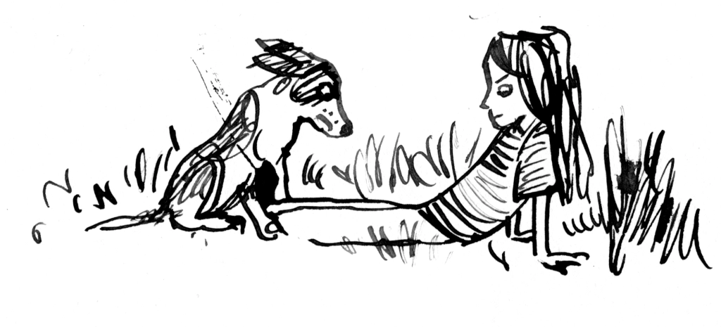
Pen and ink. Obviously this is all about the line. But it’s also about embracing a medium that can’t or won’t be fully controlled. I worked pretty small with these and just enjoyed making lots of small doodles. Perhaps some more finished work will come later.
And charcoal or soft pastel. This is less about the line and more about the tone, but really it’s a delicate balance of both. And there’s an element of mystery that comes from the smudgy indistinctness. It feeds the imagination. I haven’t found my mojo again with this quite yet, but I have been enjoying the start of the journey.
These two are a bit obvious. I like this little guy.
Lastly, I did a couple of tiny wash drawings with a touch of pencil detail.
My daughter Remi at a fancy dress party a few years back. My son Hugo listening to music in my studio the other day. Another of Hugo.
Thanks again, Phil. It has been fun to provide the prompt this time around! x
Endpapers are a particular favourite of mine, both old and new. I love to create the ends for the books that I illustrate. They’re wonderfully freeing, because they’re not required to go alongside an author’s text, nor do they need to follow along in the exact same style or medium as the other illustrations. They need to feel as though they belong in the same family as the rest of the book, but they can fly off in all sorts of playful directions, and frequently do.
Sometimes it’s lovely to take a purely decorative approach, using whatever medium seems complementary to the book, without direct reference to the story at all. Decorative endpapers may just be stripes, spots or splashes and can look beautiful, as though the reader is opening a brightly wrapped present – which in a way they are!
Mostly, I am so involved with the text that I can’t resist linking the ends to what’s inside. Sometimes I like to refer to a repeating motif in the book such as seagulls, and a little black cat as we see in Thunderstorm Dancing. Or I refer to the setting of the story, such as the forest in Leonard Doesn’t Dance. Sometimes I like to tell a bonus story without words, so that when the book has been read and the story is over, there is somewhere to linger and to imagine our characters in their next adventure or in their everyday lives.
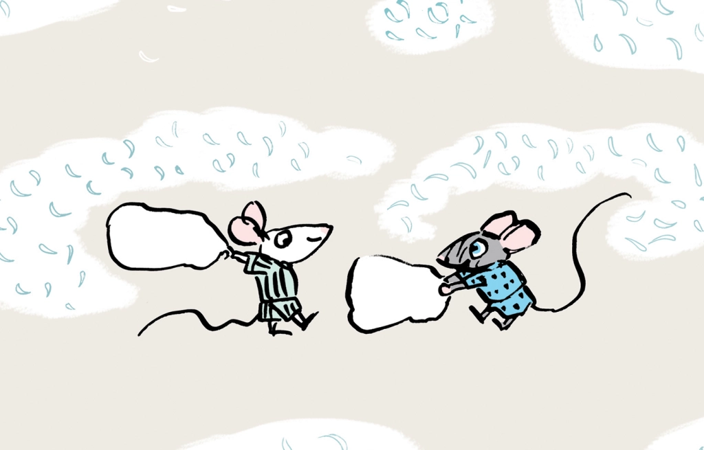
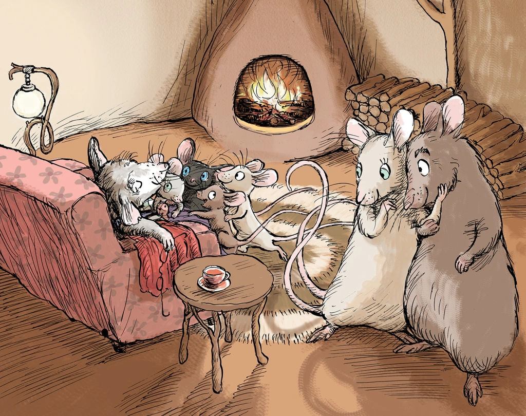
Goodnight, Mice! is a bedtime book, so the ends are muted in colour and evocative of a pyjama pattern. But I really wanted to play around a little further with these sweet mice, so I made tiny, simplified sketches of all of the family members. It was fun creating shorthand versions of each of the characters. The twins of course, are causing mayhem with a pillow fight, and there are stylised feathers floating everywhere (made by pressing down hard with my poor, mistreated dip-pen nib).
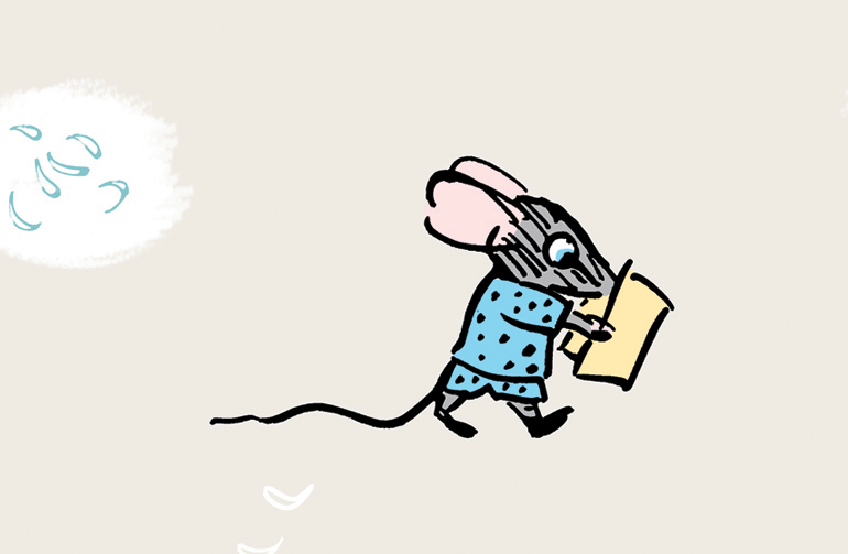
Mitzi and Billy – up to mischief as usual.I feel that Clementine will not be happy about this. Books and bedtime go together like cheese and… mice. So I put lots of books on the ends as well. I really hope Billy is not going to flush before Mitzi gets off the loo…This is the original family from the internal illustrations. Still loose, but more fully formed. (That was not a toilet joke.)
The endpapers for Thunderstorm Dancing were originally to have been printed in two colours, which is why I set them up in black and blue, (black and red for the rear ends) but Allen and Unwin decided to print in four colour process instead. In the internal illustrations, I had sneaked in a playful visual gag where the cat is greedily eyeing off all the fish. I thought it only fair that he got to eat his fish in the end. So below you see him washing up after his meal. (The seagulls are not amused.) In this case, I decided to do the reverse of what I had done for Goodnight, Mice! Instead of shrinking and simplifying the characters from the book, I enlarged them and made them more naturalistic in style.
Front endpapers forThunderstormDancing by Katrina Germein and Judy Watson. Rear endpapers for Thunderstorm Dancing. This is a detail of the cat as it appears, quite small, in one of the internal illustrations. Front endpapers for Leonard Doesn’t Danceby Frances Watts and Judy WatsonRear endpapers for Leonard Doesn’t Dance.
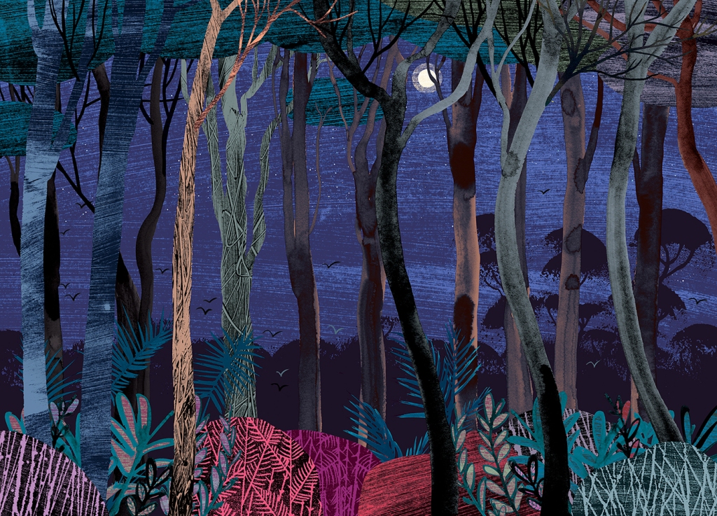
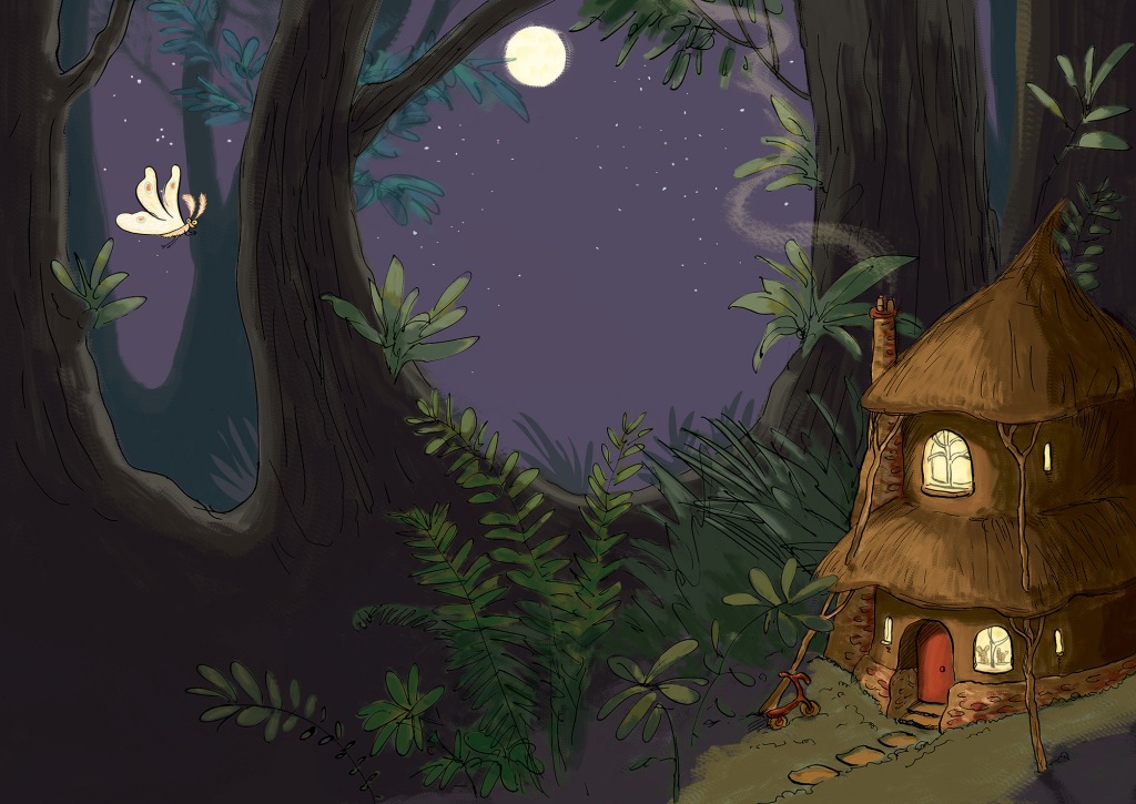
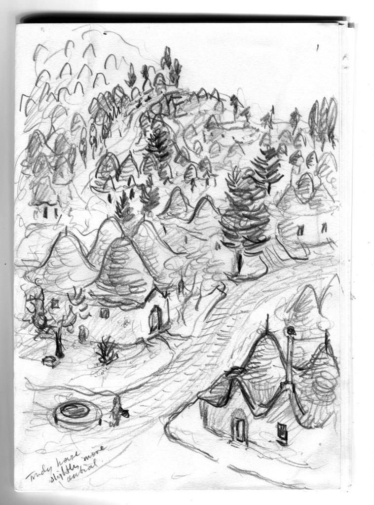
The ends for Leonard Doesn’t Dance are mostly decorative, but they also set the scene for the story. I wanted them to be sumptuous, because I enjoyed making Leonard’s forest world so much. The front and back ends are continuations of the same setting, except that the moon is lower in the sky after the birds have been partying all night. The party lights can be seen in the distance.
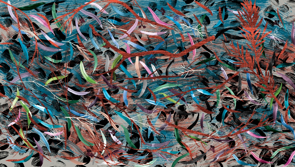
These ends are mostly decorative too, but they hint that in this story we will be looking closely at the forest floor. They were a delight to make, involved a lot of glorious inky mess, and they have their very own classroom activity. You can find it here.
When I was thinking about what kind of endpapers would be best for When You’re Older, one of my ideas included origami sea creatures, and one of them included a paper crown. They looked like this.
There were a few reasons why these ideas might have been fun and effective:
• Firstly, they are bright and cheerful and the scale of the images is large, which made a nice contrast with the fine detail of much of the book.
• Secondly, they are an easy way to communicate to someone choosing a book, that the story is suitable for a young child.
• Thirdly, they help set the opening scene in the homely world of the brother who is enjoying some paper craft. The crown concept shows us a close-up of what he is doing on the title and half title pages. The origami concept gives us an example of something he might do on a different day. And it leads the reader into the theme of sea creatures that repeats throughout the story.
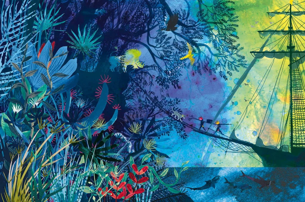
In the end we decided that the treasure hunting scene (below) would be best, because it is truly dreamlike, and hints that we will be entering a world of the imagination. It reflects the illustration style of the adventure part of the book; full of detailed vegetation, creatures real and imagined and with our boys painted in silhouette. But it is subtly different, in that it is rainbow hued and uses blue instead of black for the details of the ship and characters. The blue has a hazy feel and helps to suggest the dream state. The feel of the endpapers is decorative, but it is really a ‘bonus story’.
Endpapers for When You’re Older by Sofie Laguna and Judy Watson
I had a second idea for a bonus story and I hoped to have different ends front and back, telling two dream adventure tales. But it would have taken too long to complete. I hope to make the second illustration as a standalone, and if I do it will be available as a print. (It involves a giant squid, deep sea diving and more treasure!)
Some people can draw any building or interior with a sensitivity that invests it with warmth and personality. I truly admire them. For me, all those straight lines are problematic. I don’t feel any love for drawing architectural shapes, even though I love architecture itself. I prefer the outdoors and organic forms, including people and animals. The surface textures, the curved lines and the movement of figures or landscape are much easier for me to successfully express.
Most illustrated books require at least some built spaces to be drawn, and I’ve dealt with this in different ways for different book projects. Here are a few of them.
Cover design by Sandra Nobes for ABC Kids (HarperCollins). I remember getting emotional when the publisher suggested the mice could be printed with a spot varnish. I felt that being soft and velvety creatures, they shouldn’t be made hard and shiny! I get quite attached to all the characters in my books and become a bit protective. Embarrassing, but true.
In Goodnight, Mice! By Frances Watts, I made the house organic, the walls, doorways and furniture curved. I took my inspiration from straw bale homes, wattle and daub homes, and hand-crafted furniture. Using a dip pen and ink, there was little opportunity to be overly fussy. Drawing with a dip pen sometimes feels like trying to control a half wild pony that’s running away with me.
The opening scene from Goodnight, Mice! showing a very small house with an enviable chimney.
Getting ready for bed, and selecting a book from a rather quirky bookcase. The kind of bed that inspired the mousy furniture. (The mice must have used much smaller sticks!)Sandra Nobes also designed this cover, for Allen and Unwin. The book has just been re-released in paperback. Hooray!
With Thunderstorm Dancing by Katrina Germein, I was happy with the small drawing I did for the back cover (below). Perhaps it worked for me because of the loose lines of the dip pen but especially because of the small size. There’s no room to fuss with a 30mm wide building. Snuggling the building into the hill and embedding it in a stormy sky helps to give it a certain ‘rightness’. It takes on the personality of its surroundings.
A small windswept beach house and matching chook shed for the back cover of Thunderstorm Dancing.
The veranda was perhaps not as successful as I would have liked, being rather stiff, but I made the focus the stormy lighting; the contrast between dark clouds and the golden late afternoon glow of the beach and figures. I added texture to soften it a little. Eep!
A lot of straight lines for a non-straight-liner! Hopefully the focus remains firmly on the atmosphere. An interior that had to look warm and cosy, yet storm-lit. My selection of furniture reflects again my need to put curves in wherever possible! And it is funny to me to see how often my colour scheme is a soft, bright red and a greenish teal. This lovely cover design is by Amanda Tarlau, for Walker Books.
My garden shed from Searching for Cicadas by Lesley Gibbes, was created in a similar way. Mostly pencil and wash, but with added texture and digital colour. (Note the soft red and greenish teal colour scheme!) My architecture leaves room for improvement, but hopefully the warmth of the characters on the page, the light, foliage and pets set the right tone. And on the next page, we happily marched off into the bushland away from human structures! Phew!
Another black cat. I have a one-eyed black foster cat climbing over my drawing board as I’m typing this and my three-legged dog Noodle appears in the illustration, proudly flourishing four entire legs. Off into the natural world.
I also have an unpublished project, where the my buildings again reject straight lines. Based on the trulli of the Puglia region in Italy, they have lovely domed roofs and soft curving interiors. I even stayed in a glorious trullo here, and did some research for my illustrations.
Trulli from a dummy book Trulli homes in Ostuni, Italy.
But it was exciting to take a different approach to the house in When You’re Older by Sofie Laguna. Here I used the straight lines of the room and other man-made objects to my advantage. I accentuated them, taking inspiration from the marvellous Ezra Jack Keats and pared them back to simple blocks of colour that mimic paper collage. Now they acted as a foil to the scenes beginning on the next page, where the story moves into the imagination and benefits from a strong contrast in style.
I know you’ve seen it already, but here is the cover of When You’re Older, designed by Sandra Nobes for Allen and Unwin. Out 1 March 2022. Straight lines, no regrets. The opening bedroom illustration in When You’re Older.
In the bedroom at the start of the narrative, we have animals and ships on wild seas contained in frames that have been reduced to a series of rectangles with no attempt to suggest a hook or a natural hanging angle. The boy too is sitting, waiting in a rectangular room like the paintings in their frames. But the small animals dotted around the room, the houseplant and the two kinds of boat (origami and painted) have fed his prodigious imagination which breaks loose as we turn the page.
Rampant curves and movement take over the book from here. (Do I spy soft red and greenish teal?)
Here everything has broken out of its containment and we see the beginning of an undulating landscape, teeming with life and with an exaggerated forward slant like a slingshot that has just been released to propel our characters forward into the world.
I’ve used the solid graphic shapes here and there through the book, most often for man-made things like bikes, ladders, tents, and the fanciful double-ringed shape that suggests a view through binoculars. So the contrast between rampant texture and solid graphic shapes continues. But on the pages dedicated to the immense power of nature, it is not really in evidence at all, and expressive brushstrokes set the entire scene until we return at last to our original bedroom.
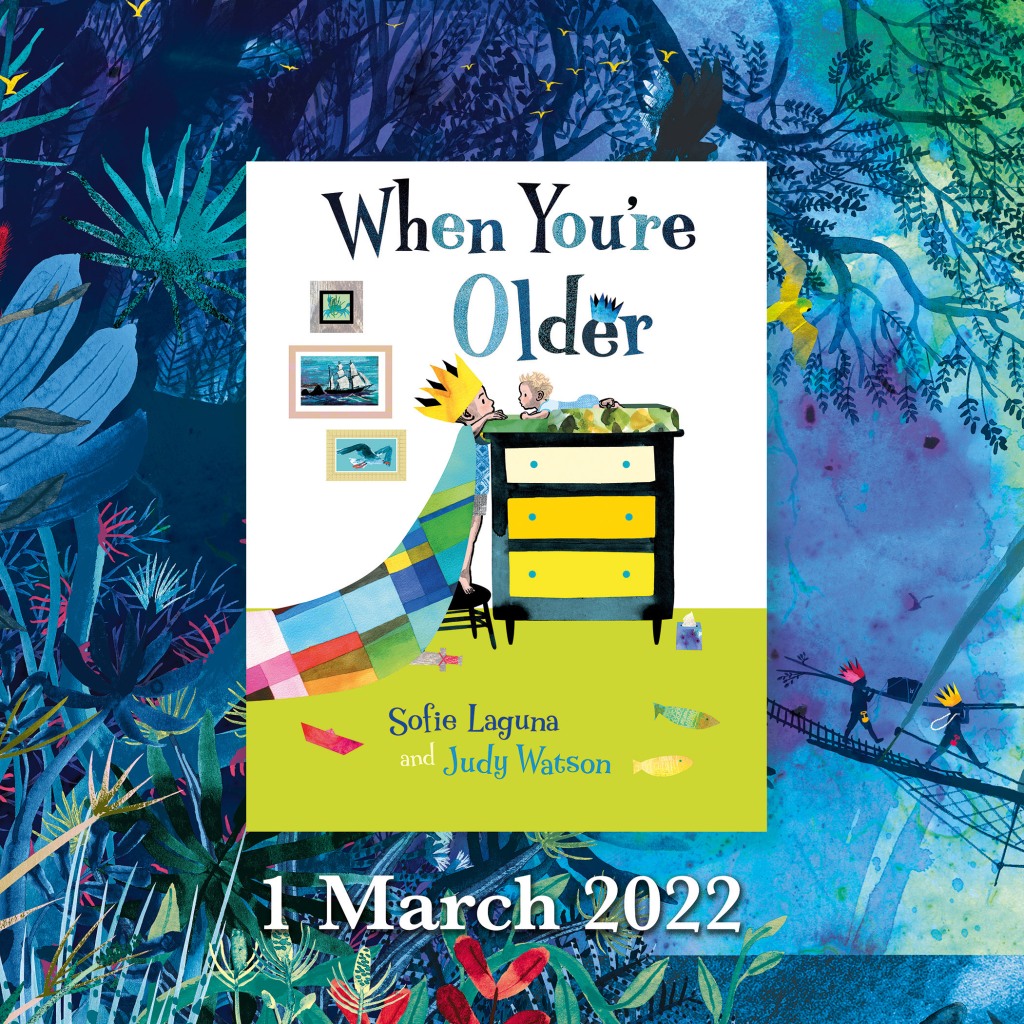
Upcoming events to celebrate When You’re Older
Wednesday 23 March to Tuesday 19 April Colour, Line and Collage: Mixed media works in and around books. Exhibition of original works including the patchwork paintings featured in When You’re Older. Some prints of the illustrations will also be available to order. At Streamline Publishing and Gallery 22 Commercial Place, Eltham 3095 Open Wednesday to Saturday 11am – 4pm, Every second Sunday 1pm – 4pm. Enter from the Town Square. Above Eltham Bookshop
Saturday 26 March – kids’ drawing / collage workshops and signed book sales. Frankston Library 60 Playne Street, Frankston Phone 03 9784 1020
Sunday 3 April WORKSHOP 2.30pm – 5.30pm STORYBOARDING – taking a text and moulding its shape on the page. A book illustration workshop for adults and young adults. This three hour workshop will be hosted by Eltham Bookshop and held at Streamline Publishing and Gallery 22 Commercial Place, Eltham 3095 (Above the bookshop) To coincide with the launch of When You’re Older and the exhibition Colour, Line and Collage: Mixed media works in and around books. I will take participants through my process: How I responded to Sofie Laguna’s text and, together with the publishing team, brought her words together with my ideas to create finished art for the book. After a short break, participants will use a sample text to create a storyboard of their own. Entry$80 includes a signed copy of the book, light refreshments and all materials. Bookings can be made through Eltham Bookshop Tel: (03) 9439 8700 Email: books@elthambookshop.com.au
On the first of March When You’re Olderwill be in bookshops. Hurrah! And I’ll be in two of them on the same day, decorating the windows to celebrate the release of the book. I’ll be starting out at The Little Bookroom and then zipping across to Readings Kids.
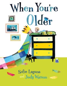
I’m really happy with the cover. We went all over the place exploring cover options, including under the sea and up a tree. But this one feels right. The focus is squarely on those two faces. They’re the heart and soul of the book. (I admit I’m a bit infatuated with the chest of drawers, too.)
Book designer Sandra Nobes did an amazing job with the typography. Her title lettering expresses the tall and short of our two characters, complete with small crown. And her selection of typeface for the creator names took inspiration from my hand-drawn letters and is a near perfect match with a few less curls. (You can see my curly writing above, with a baby seemingly floating over it!)
If you’re thinking the book is about nappy changes, don’t be fooled by the box of tissues, although you might need one yourself. Perhaps, like me when I first picked up the manuscript, you’re thinking that the book will be about sibling rivalry. It’s not.
Inspired by hopes for her own two children and interestingly by the imprisonment of journalist Peter Greste in 2013, Sofie Laguna’s words are about love and about brothers looking out for each other. About a big imagination. A big world. A big adventure and big danger.
There are also lots of tiny things.
One of the great joys of parenting small children for me, was the experience of reading aloud to them. I loved to witness their immersion in the world of each picture book; their interaction with the page as well as the story, fingers keenly pointing out the important parts, and often the tiny details. So while I was working on When You’re Older, I imagined little hands holding the book and little fingers pointing. Every lizard, butterfly and bird was made for this purpose. Every footprint in the snow.
I think there will be much counting! How many birds can you find? How many bats? Ducks, lizards, butterflies? These small things are only footnotes to the main story, I know. But I am so looking forward to seeing some real fingers exploring the book.
Please pop in and say hello if you’re in Melbourne on 1 March or in Mornington on 4 March. There will be signed books available to purchase. I’ll be the one with the paintbrushes and Posca pens, decorating the windows. And I look more or less like this.
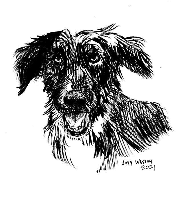
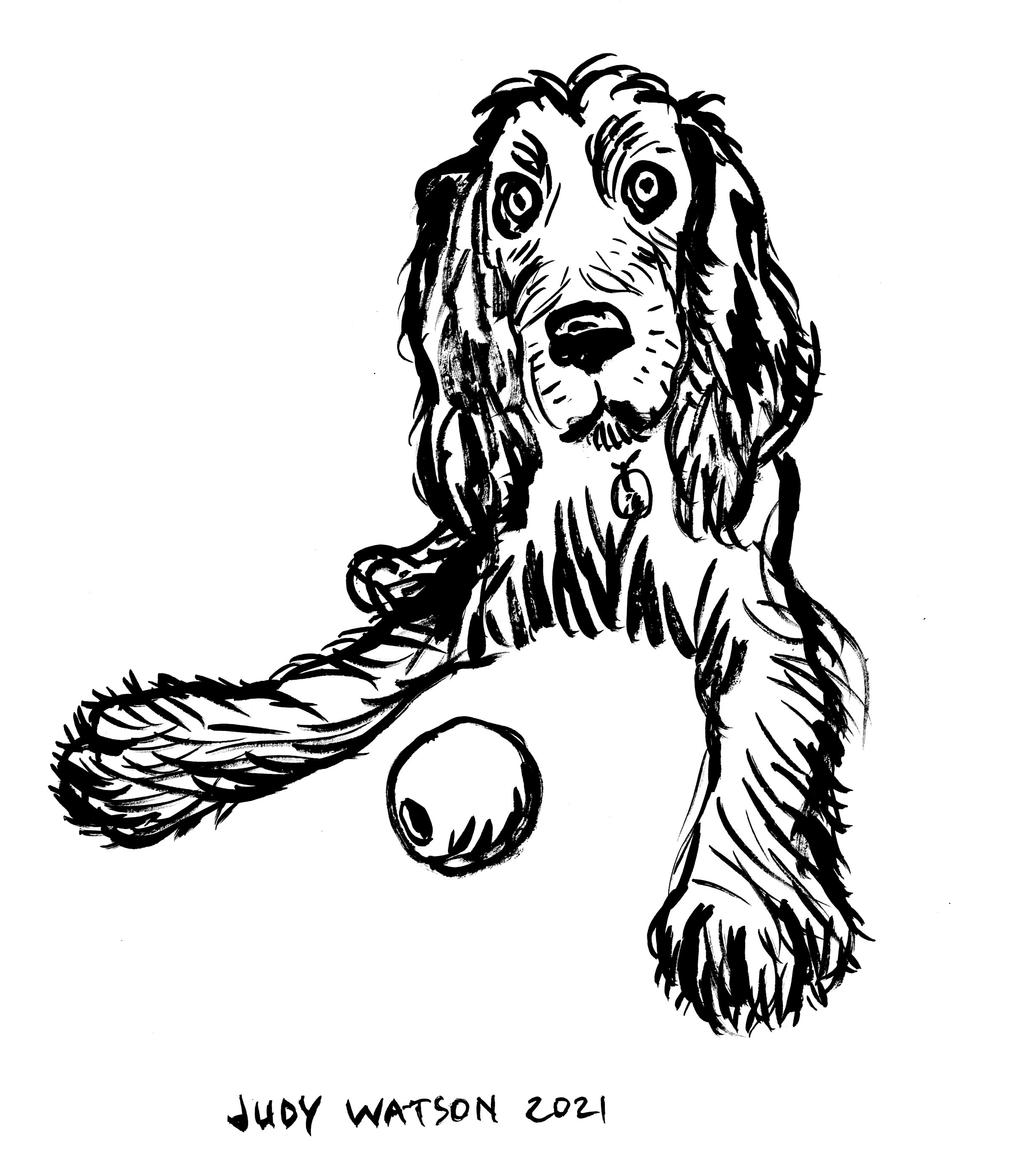
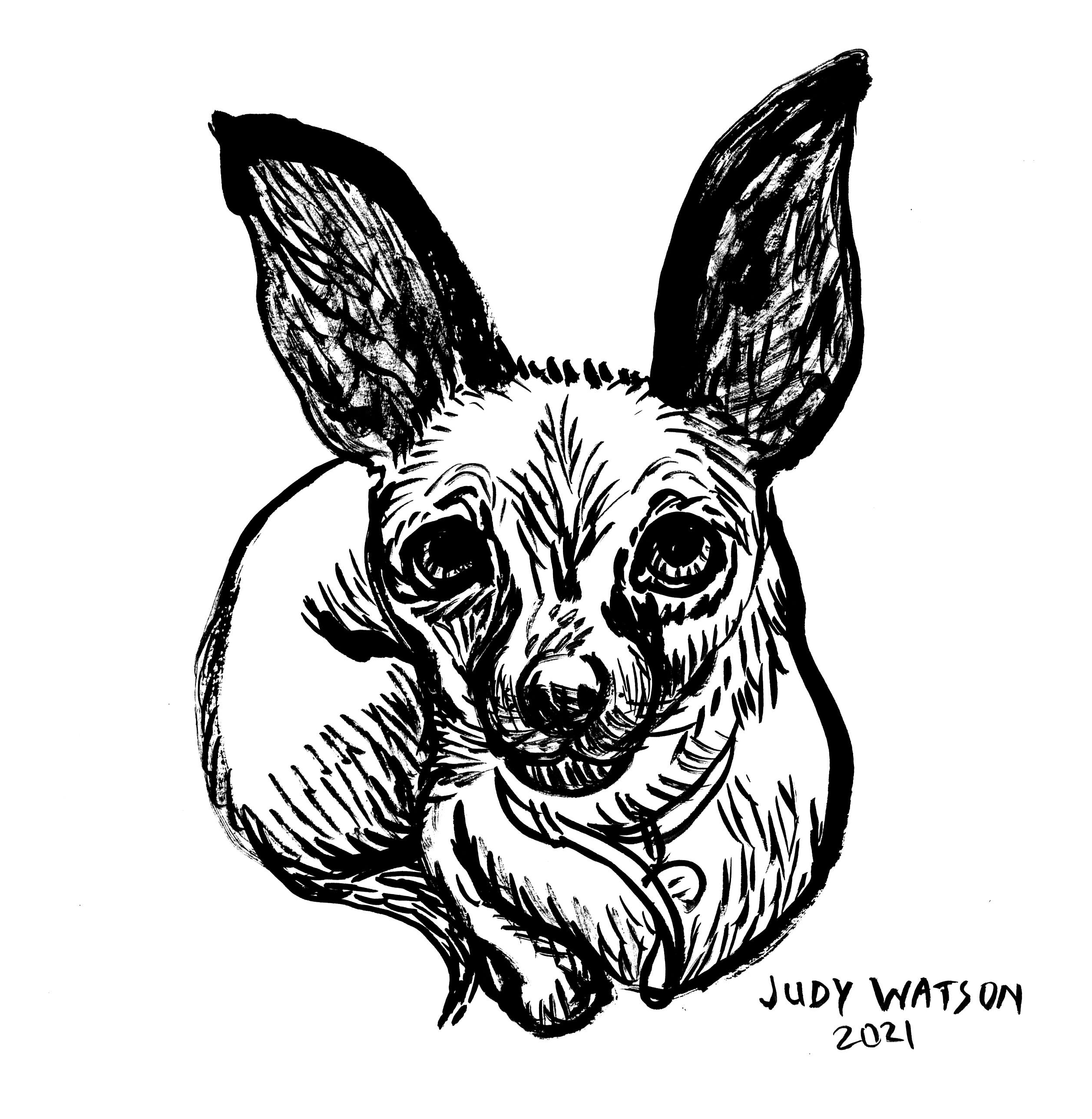
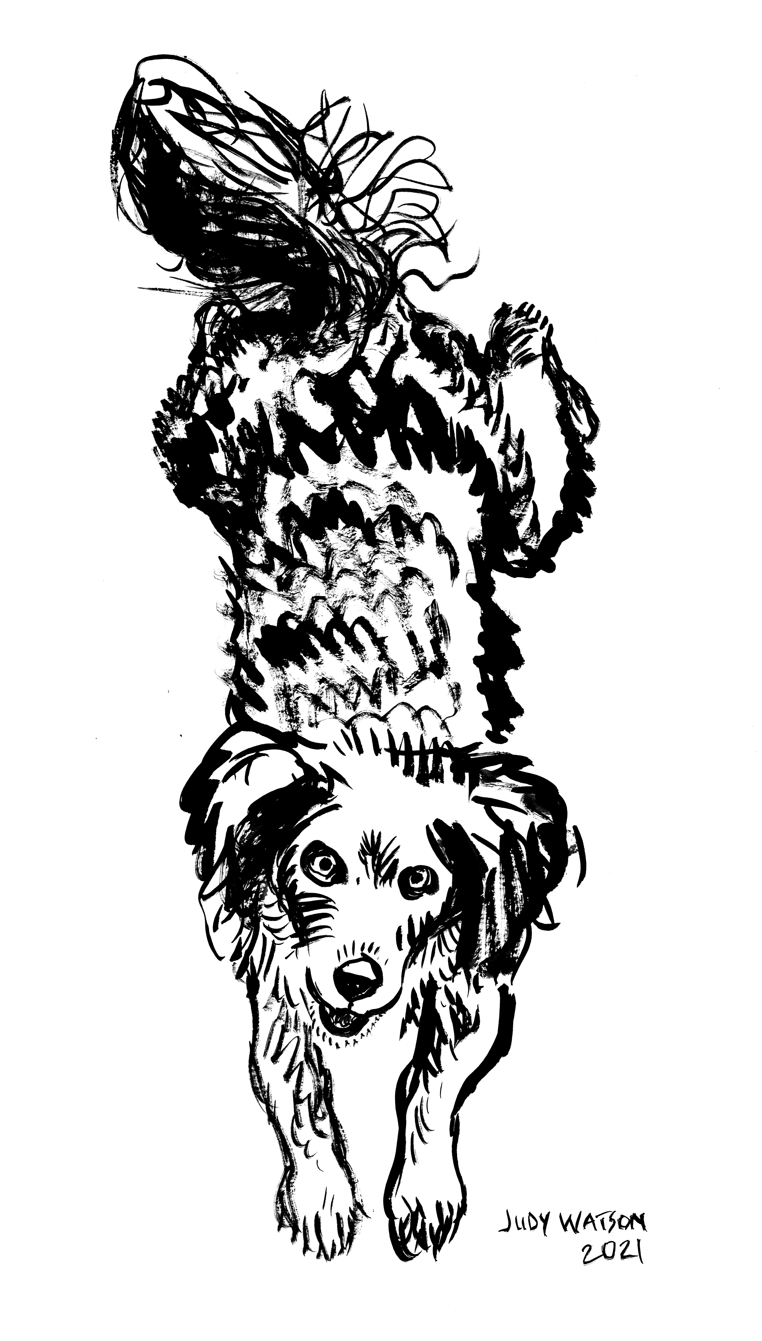
Animals are my joy and consolation. If I’m struggling to concentrate, cramped by artistic angst, or simply need to warm up my drawing brain before starting work, it’ll be a bird, a dog, a horse, or sometimes a cat. (Cats are so much harder and it drives me round the bend sometimes.) But especially, it’ll be dogs. By the time I’ve scribbled half a dozen, my brain has usually caught up with my hand, (or is it the other way around?) and I’m ready to tackle a forklift or a crane… Who am I kidding? Never a forklift or a crane. Please don’t ask me to draw a forklift. Probably not a corkscrew. (Forklift authors, you know who you are.)
Anyway, when I noticed a little fundraising event coming up called Bad Pet Portraits, that raises funds for an organisation called Pets of the Homeless, my first thought was ‘I wonder if they would accept an erratic and occasionally good pet portraitist.’ Because this was for me!
We work to help keep vulnerable people and their pets together by alleviating the burden of providing essential pet care during times of hardship.Pets of the Homeless.
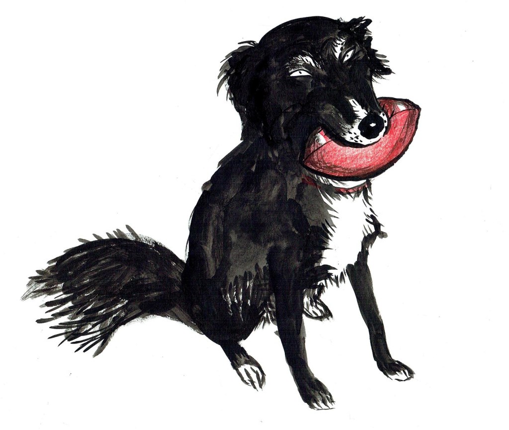
Happily, they didn’t seem to care at all what kind of pet portraitist I am, and I was signed up for a few hours of manic pet drawing. I’ve participated in two of their fundraisers now. The first time I attempted to make my portraits ‘bad’ or at least a bit funny, with mixed results. But really the stars of this show are the people like Phil Heckels whose pet portraits are pure magic and I can’t compete with that. So the second time around, I decided to just draw pets the way I draw pets, with the simple rule that I would draw them quickly and not fuss over them. In this I mostly succeeded and you can see some of the results below. (I did 23 in total, including a goat and several cats.)
This giant pooch, (a Great Dane mix perhaps?) died the day after my portrait was submitted and the owner was very grateful to have the portraits. (I did two of that one.) I felt so sad for the owner, but so glad I had drawn the dog.
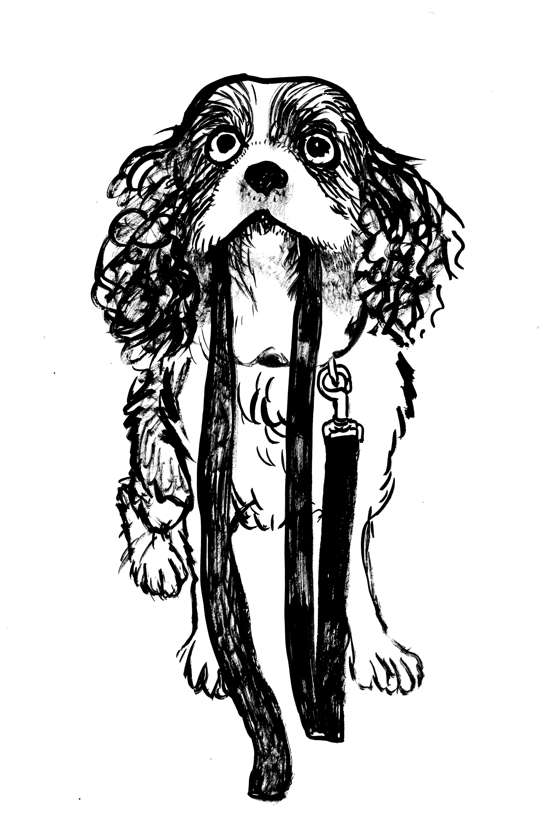
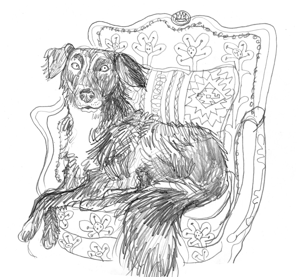
Then artist Liz King-Sangster asked me if I’d draw her muse and beloved dog Gypsy. And here she is below. She has the most excellent ears and a happy face with a soft expression. I did fuss a little over Gypsy. Liz sent me the below photo as reference, with Gypsy lying on the ground looking very angular and with her front paws on the pebbles. I will not lie. I found the foreshortening somewhat challenging and the first time I drew her, I mistook her knee for a tail, and her tail for a very long foot! After lightening the photo, I discovered the truth. But ultimately, this pose defeated me. I couldn’t capture her expression, or her front feet! I have several sketches that demonstrate my struggles, but you will not be seeing them here. The most successful of them made her look cross-eyed.
Gypsy – the softest bag of coat hangers ever seen. All angles.
Not to be a quitter, I decided to look through Lizzie’s Instagram feed for more pictures of Gypsy to warm up on, and found this gorgeous photo of her looking slightly damp and full of joy. I can’t say the foreshortening was any less significant, but it worked okay this time, and I seem to have accidentally de-magnified her nose!
This next photo features Gypsy on her throne with a royally amused expression. My second attempt got closest to the humour, but I still haven’t nailed it. It’s all in the eyes. And true to form I drew it on the bottom corner of a bit of paper, so that I had to squish her royal highness onto the page.
Lastly, I found this rather hilarious photo of Gypsy with her squishy rugby ball, squinting her eyes in a very knowing way. The resulting drawing may not be Liz’s favourite of the images, but it made me smile. Fittingly it has returned to the true Bad Pet Portrait ethos.
I hope I get to meet the real Gypsy one day.
For anyone who is interested, the next Bad Pet Portraits event is in March 2022.
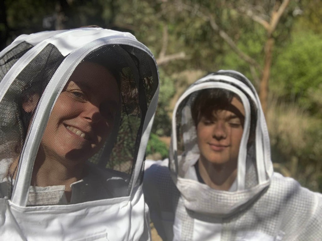
The prompt for the 38th Kick-About is one of Matisse’s lovely cut-outs, titled White Alga on Orange and Red Background. I’m a big fan of drawing with scissors as Matisse described it. But I didn’t pick up the scissors. For one thing, the bees kept swarming! Three more times. I mean, crikey! We have managed to capture each of the swarms. (Today I noticed that the neighbour‘s bees are swarming. I‘m letting that lot go.)
We now have not one hive, but four. The smallest swarm was successfully reunited with the original hive. I have learned so much in a fortnight! Because I absolutely can’t help myself, I have begun the process of naming the four hives after fictional places. (Scott argues in favour of One, Two, Three and Four. *sigh*)
The original hive is three boxes high, was neglected for the last few years, and became overpopulated. It’s no longer neglected or overpopulated, but it’s still tall. It is going to be either Gormenghast, or Ankh–Morpork. Both are very appealing, so we will continue thinking about that.
The smallest new hive is called Dagobah. It’s getting supplementary feeding with sugar syrup. Some of those bees fell in the stormwater drain while we were bringing them down from an overhanging branch. I fished them out of the water with a net but things didn’t look good for the piles of cold, soggy bees on the ground and dark was falling, with rain forecast. (Told you we have been learning…) However, the next day when the sun reached them, they began to recover and almost all of them rose up in reincarnated glory and returned to the colony. After this swampy experience, the name seemed obvious. (There are several Star Wars fanatics in this household.)
The original swarm from my previous post is a Thing of Glory! It is buzzing and growing and brimming with pollen and nectar. Cells are filling with larvae as new bees are created. Hugo has named this hive Sanctaphrax. Perhaps he feels this new hive will be a home of intellectual pursuit and heroic deeds. At any rate, it’s a great opportunity to honour his favourite book series.
This only leaves one hive unnamed. It is middle sized and thriving. It has had a lucky beginning, in that we donated brood from the old city to help them build their new colony. I could name it Serendipity, but it has to be a fictional place. So we will think some more on that one.
Once again, I am talking more about bees than art! What is going on?
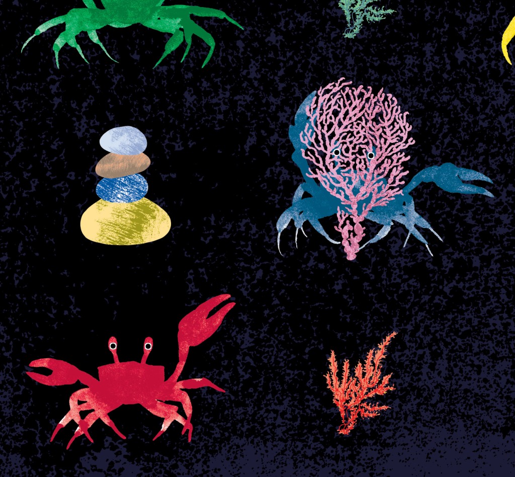
This is an accurate reflection of my world just at present, but it’s probably time to mention that as soon I saw the prompt for the Kick-About I thought of seaweed, (not bees) and in particular I thought of the seaweed I painted for When You’re Older by Sofie Laguna; the book I have just finished illustrating.
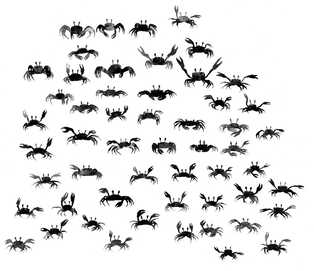
There are several pages featuring the sea in this book, and in three of them I took the opportunity to create underwater scenes full of colourful seaweed. So when I was working on ideas for the endpapers, one of them featured crabs and seaweed. I never finished this concept, because it didn’t seem as apt as some of the other ideas, but after spending a whole day painting tiny crabs, and working them into patterns, I did fall in love with the little guy at the top of this post, hiding behind his seaweed. He totally captured my heart. I made a few more little arrangements of crabs, but I wasn’t sure they worked as well when reduced in size.
Crabs. Are you confused? We’re on crabs now. Keep up!
Today I revisited the unfinished endpapers and played around a little bit more. They’re probably nicer on white, but hey.
And here are some small sections of this non-endpaper creation.
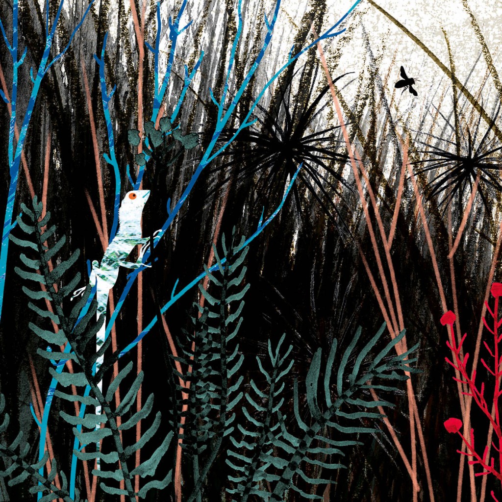
The prompt for the 37th Kick-About could hardly have been more suited to me and my natural inclinations. It’s inky and leafy and Australian. It’s Peter Mungkuri’s Punu Ngura (2019)
From the Yankunytjatjara, Southern Desert region comes this beautiful black and white ink drawing on paper by Peter Mungkuri. I’m glad this prompt was chosen because it has introduced me to Mungkuri’s work, which is perfectly balanced, sumptuously decorative and calmly natural all at the same time. It is well worth a visit to the Art Gallery of NSW website to see a collection of his work. Swoon!
What strikes me most is the combination of the loosest of ink splatters with far more careful and detailed patterning. I was going to explore some inkiness yesterday (Yep! Last minute again!) to see where an observation of Mungkuri’s work might take me, especially with regard to the use of white ink patterning over the top of the looser ink layers. But before I could begin something happened.
Our bees swarmed.
This happened last year and we weren’t prepared. The hive became overcrowded, and half the bees took off to find roomier accommodation. This time, we had not only added an extra box to our existing hive to give them extra space, but we had prepared a separate hive in case they swarmed, and had it ready for the new colony to use. Well, not perfectly ready. The frames were in, with wax and wire for the bees to build on. But I wasn’t completely finished with my exterior paint job.
This is the old hive with a new box added on top. But this colony is thriving and they needed more space than this. New hive, unfinished. Artist dissatisfied.
This is our new hive in the middle of my paint assault a couple of weeks ago. I had to stop when the paint was so thickly applied that it needed a few hours to dry before I could apply anything more with a brush. Alas, other tasks have called me since then. I hadn’t yet reached a satisfactory conclusion when the bees swarmed.
I should be annoyed. Pesky bees. They sent me no email, no letter and didn’t phone to say they were leaving that day. Just… buzzed off.
But I’m not annoyed. Far from it. My spring day with the bees was uplifting, empowering, mindful and full of joy. So I’m ok with the paint job. In fact, we have installed the bees in the brood box only, so I can tweak the top box before we put it in position. The roof and base are harder to alter… but who knows what might be stealthily achieved at night with a daylight bulb…
So here is what happened in pictures (and just a few words).
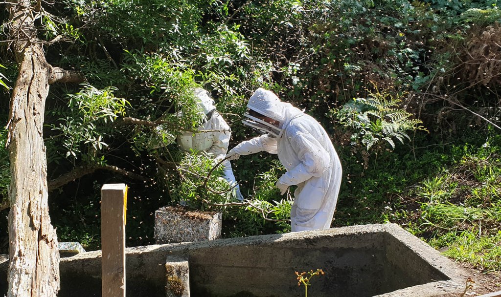
We were lucky with the location the bees chose to hang out. They congregated in the empty block next door, just by a storm water outlet, hanging from a conjunction of branches in a Desert Ash. It might have been over the storm water drain. It might have been up too high to reach without a ladder. But they chose a spot just reachable from the ground and just far enough away from the concrete drain that we didn’t risk falling into it. Phew! (I could have done without the blackberry canes though.)
First we suited up. Hugo, sorry about the shut-eye photo. It was you or me. (Blogger’s prerogative.)Then I sawed through the main branch in order to lift the swarm down to the box. It was a bit tricky because there were several branches tangled together and the bees were dangling lower with every jiggle. The blackberries bit me. They have no respect for bee suits. We gave the branch a firm shake and most of the bees dropped into the box. Hugo and I then gently scooped as many bees as we could up and dropped them into the box. Hugo worked out where the queen bees was (inside) and we gently placed the lid on the box, whilst blowing bees out of harm’s way in an undignified manner. With the tricky part over, we decided to sit in the sunshine (on the handy concrete drain) to watch the bees for a while. Some of the bees were fanning their wings near the entrance on the right. We guessed the queen was on the inside near that point and we were hopeful that all was well.
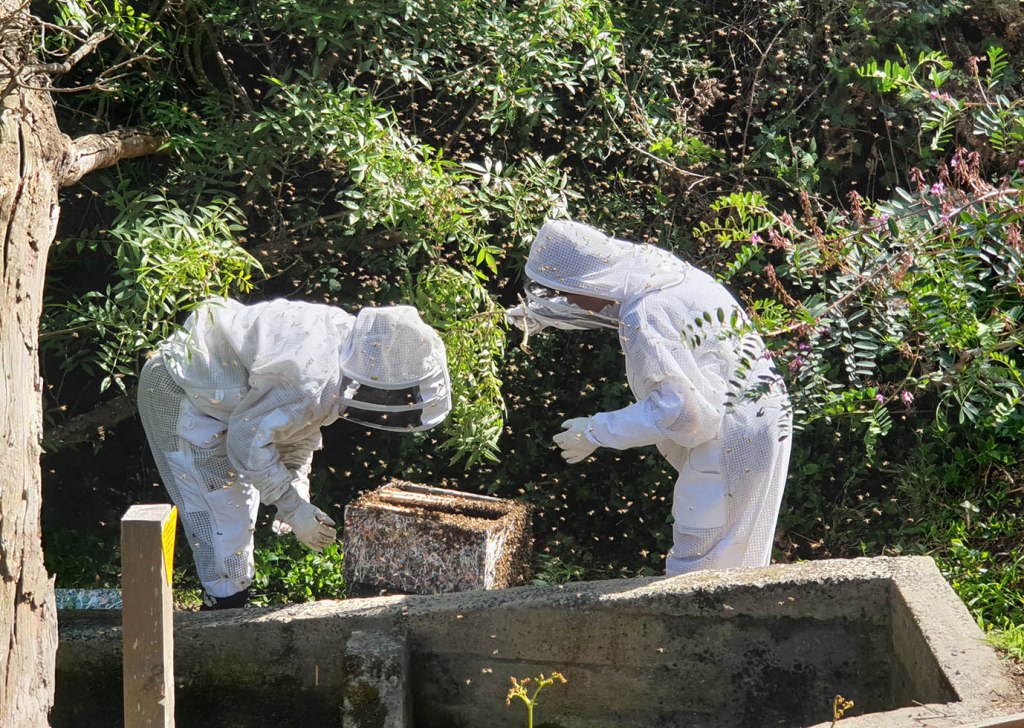
After this we stepped away and shook the bees off our suits. But then I had to go back to have another look. Just because.
This is what it looked like straight afterwards. The bees were slowly moving towards the entrance and going into the box. A couple of hours later, almost all were inside the box. We moved them into their proper location beside the other hive after dark and all seems well today.
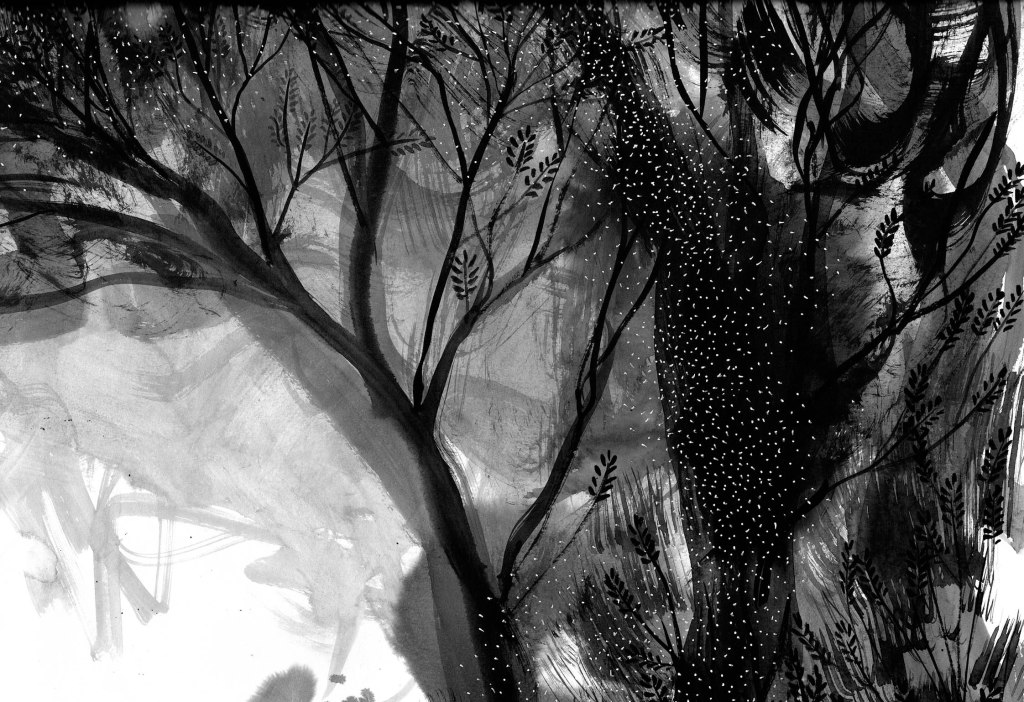
That evening, I had a bit of a go at my inky exploration of Peter Mungkuri’s plant drawings, but my mind was full of bees. And joy. So it became an illustration of Hugo and me, arms uplifted to the swarming bees.
In painting it, I was tumbling three things together: what happened last year (they swarmed and disappeared) what happened this year (they swarmed and we were in the middle of it) and what happens every year (we have a dead tree stump that disgorges thousands of tiny moths once a year and they spiral upwards into the sky in the early evening attracting a feeding frenzy of bird life. It is quite the annual spectacle.)
Finished painting. Scanned in 6 parts and assembled.
Look at that! I’ve jumped seamlessly from Kick-About #28 to Kick-About #36 without a single kick!
I was busy there for a while. By putting just about every other thing to one side, I have finished my picture book project for Allen and Unwin, and I’m very excited that I will have an advance copy of When You’re Older in my hands in late November this year. So Hip hip hoorah! But more on that another day. This rather hasty post will be about surrealism and the language of dreams.
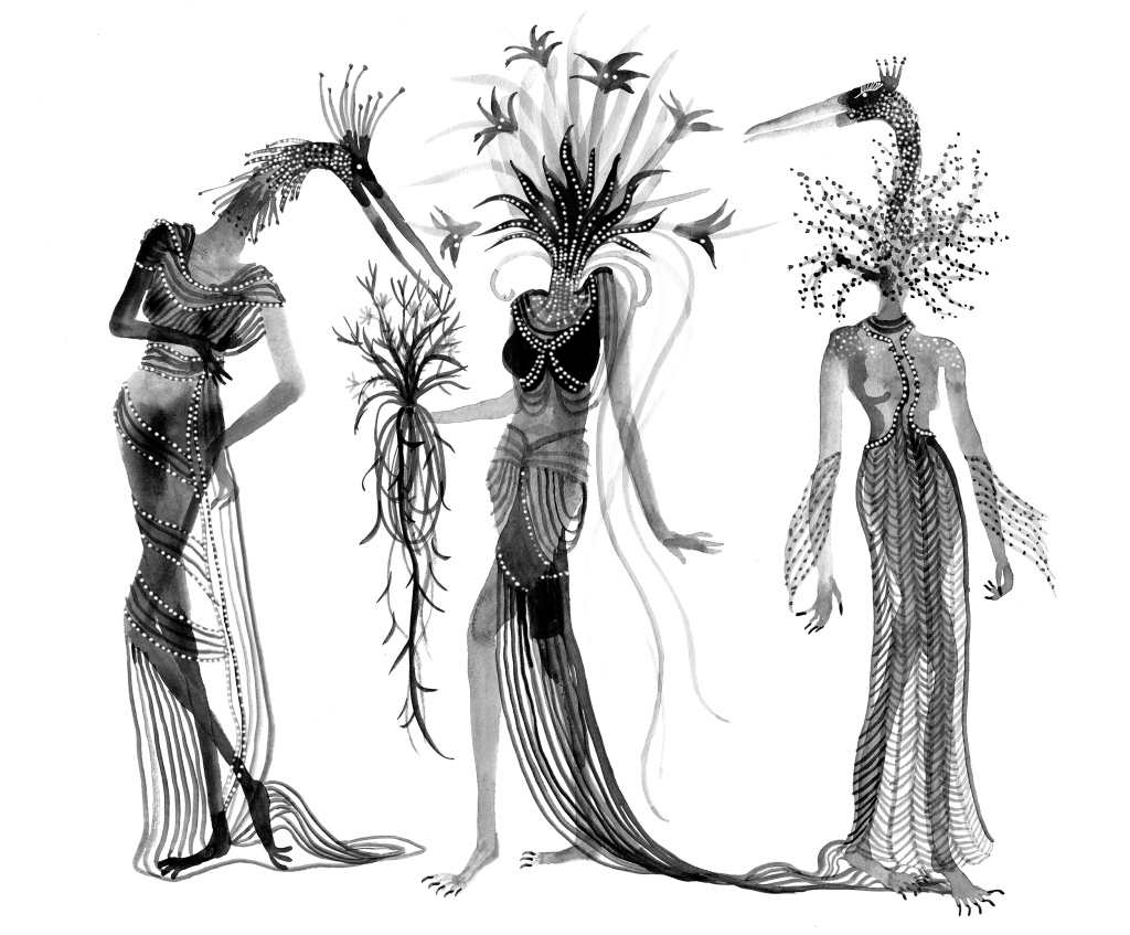
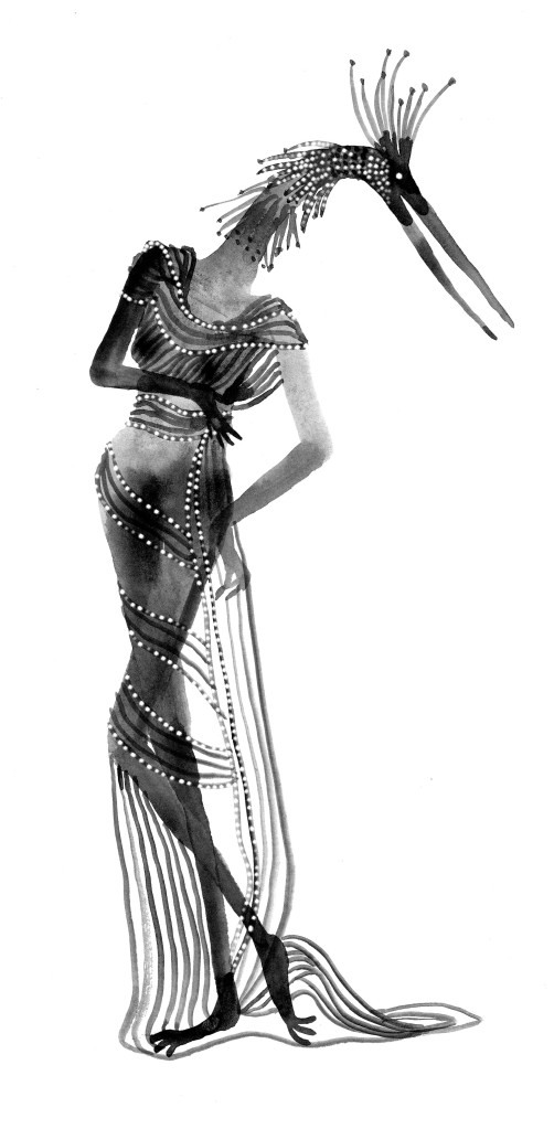
The theme is Sheila Legge, seen above in costume in 1936 as a ‘Surrealist Phantom’ in Trafalgar Square to promote the opening of the 1936 International Surrealist Exhibition … Should I call it a costume? Because she is a living work of art, the living embodiment of a Salvador Dali painting Printemps nécrophilique.
I’m sure I’m not the only one to be having vivid dreams and nightmares at the moment. Melbourne is currently still in lock-down while we wait for enough people to be vaccinated against Covid-19 to allow us to step out without swamping hospitals and losing many more lives. Unlike so many others around the world who are facing real danger and hardship, I am here, at home, living in a kind of paradise with a partner in full time work, a roof over my head, a vista of green outside my windows and the company of my family. For all this I am truly grateful. Nevertheless the night time world of my dreams is a wild one – a Rousseau Paradise, rather than a Fragonard. This was even before I started re-reading short stories by Angela Carter and Leonora Carrington… Ahem.
So there’s a coincidence! Just when I was reading the short stories of Leonora Carrington, who met Max Ernst and became involved with the surrealists in 1937 at the age of 20, the Kick-About veered into the very same territory with Sheila Legge.
This book beside my bed… Could it be influencing my dreams?
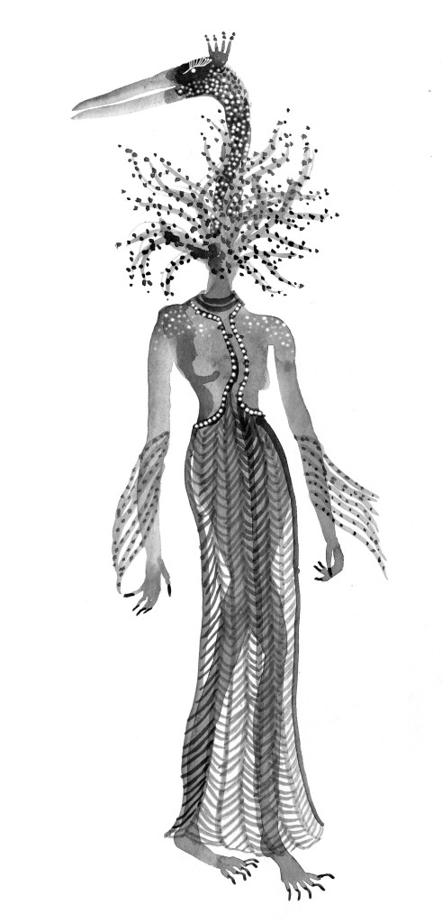
All I have to offer the Kick-About today is the beginnings of a… something… featuring some bird-headed, flower-headed women. They will possibly eat one another. I may add colour if there’s anything left of them by tomorrow. (growls softly)
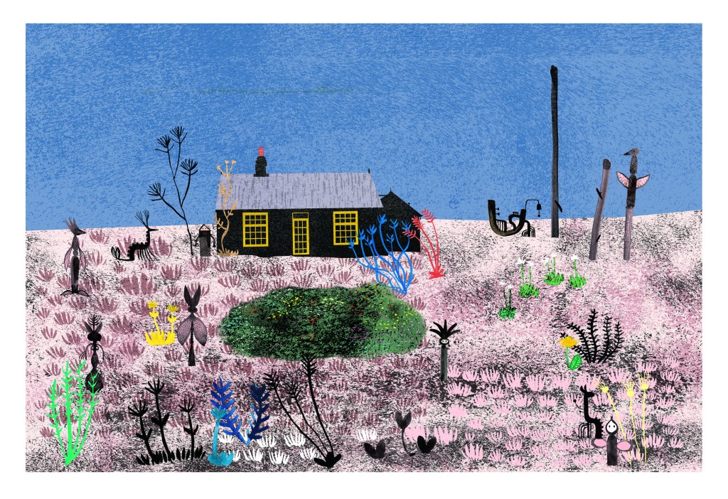
The Kick-about #28 takes a film by Howard Sooley, as a jumping off point. The subject of the film is Derek Jarman’s Prospect Cottage. I loved the film. It is beautifully peaceful. My image, a single one this time, is not very thrilling because it’s simply a rendition of Prospect Cottage, with the garden made even more minimalist, save for a few small creatures dotted about.
I’d love to do more but I haven’t time. However, this little exercise was a useful one for me, in that I was consciously dampening down my rather over-excitable palette, and also practising the careful placement of a few elements in a pared back landscape. Looking at it now, I can see that I haven’t gone far enough with either. But I’ll post it anyway.
And here is Howard Sooley’s lovely short film. Enjoy!